After pushing back a planned early-October launch, Samsung has introduced the Android 10 beta of its One UI. The 2.0 version of the Android skin follows a little under a year after the first version’s beta (released in November 2018). The concept goes counter to the earliest Android overlays, instead intending to create a simpler take on Google’s operating system.
Manufacturers’ long standing instance on putting their own stamp on Android is understandable — if sometimes misguided. Samsung’s initial stated intention for One UI is to let software and hardware, “work together in perfect harmony,” to paraphrase Stevie Wonder.

One UI is largely a success on these fronts. And Samsung is understandably cautious about the roll out, opting again for a public beta version, ahead its Android 10 release. “Select” Galaxy S10 owners in the U.S. can sign up for the program starting today, with a final release “in the coming months.” There are a lot of Galaxy phones out there, so the company clearly wants to get the experience right, gathering up user feedback in the process.
Here’s what’s new, per Samsung,
- A new, smarter layout with animated icons and improved edge lighting
- An enhanced Dark Mode that reduces display brightness while viewing content and provides battery saving benefits
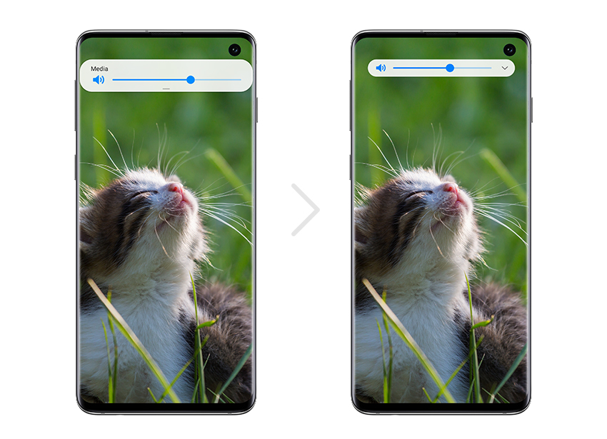
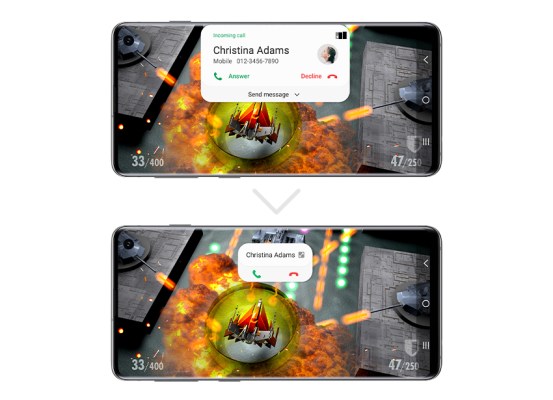
- Minimized pop-ups, embedded loading indicators and the ability to only view buttons the user needs
- A streamlined design where notifications take up less space, allowing users to stay up to date while focusing on the task at hand
- Focus Mode to pause apps temporarily for times when you need to minimize distractions
More info on Samsung’s blog.
