Apple released iOS 13, the new major version of iOS. This isn’t a groundbreaking release that is going to change the way you use your phone. But Apple has done some tremendous work across the board to improve some low-level features as well as most Apple apps.
In many ways, iOS 13 feels like a quality-of-life update. In developer lingo, quality-of-life updates are all about refining things that already work. It helps you save a second here, do something more easily there.
I’m going to talk about many of those small refinements, but I want to focus on two things that are going to matter more than the rest — Dark Mode and Apple’s focus on privacy.
Dark Mode is here
At some point, smartphone manufacturers started making bigger phones. And if you don’t want to become blind at night, Dark Mode is a must. It took a while, but it is finally here and it looks great.
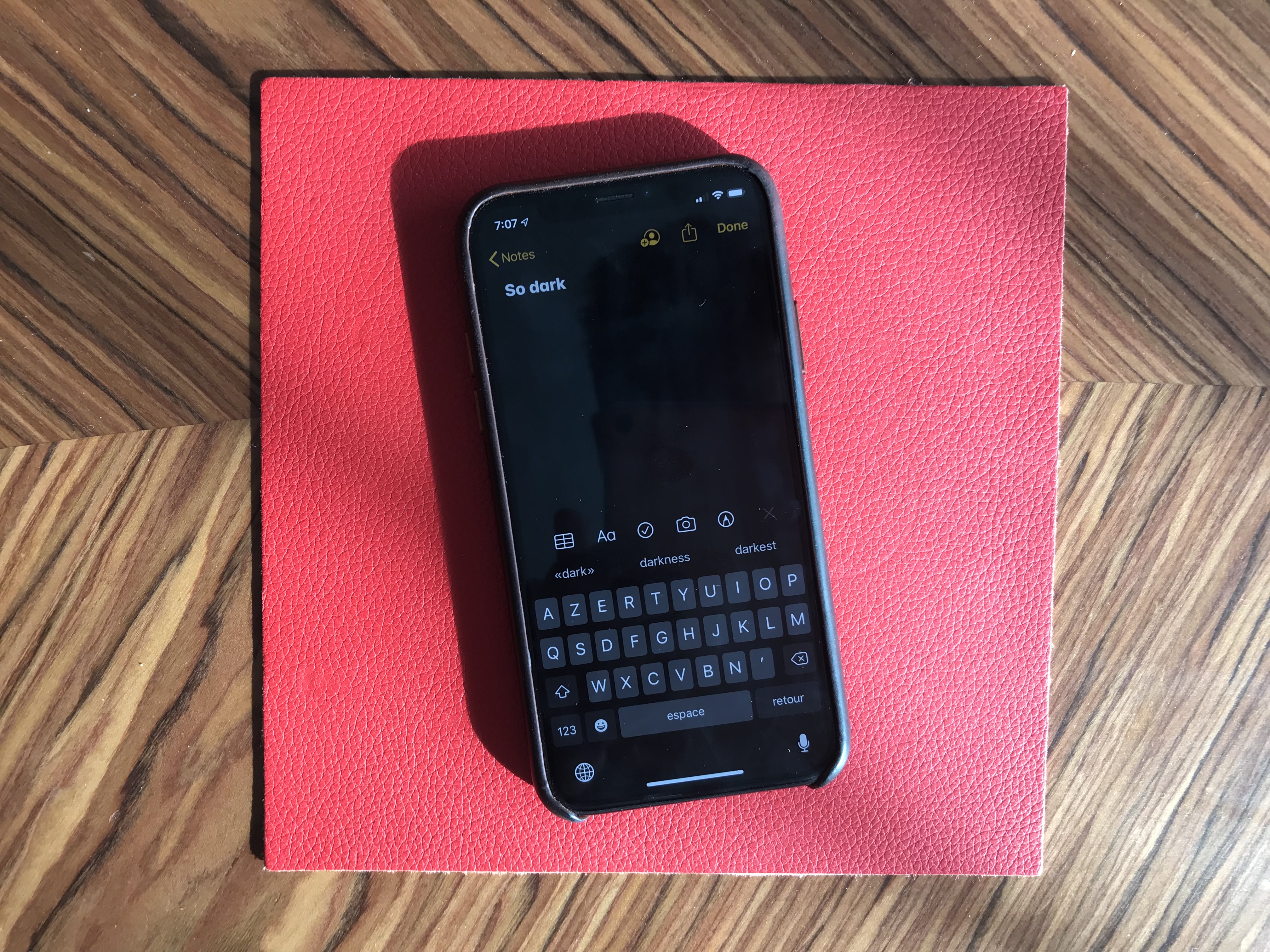
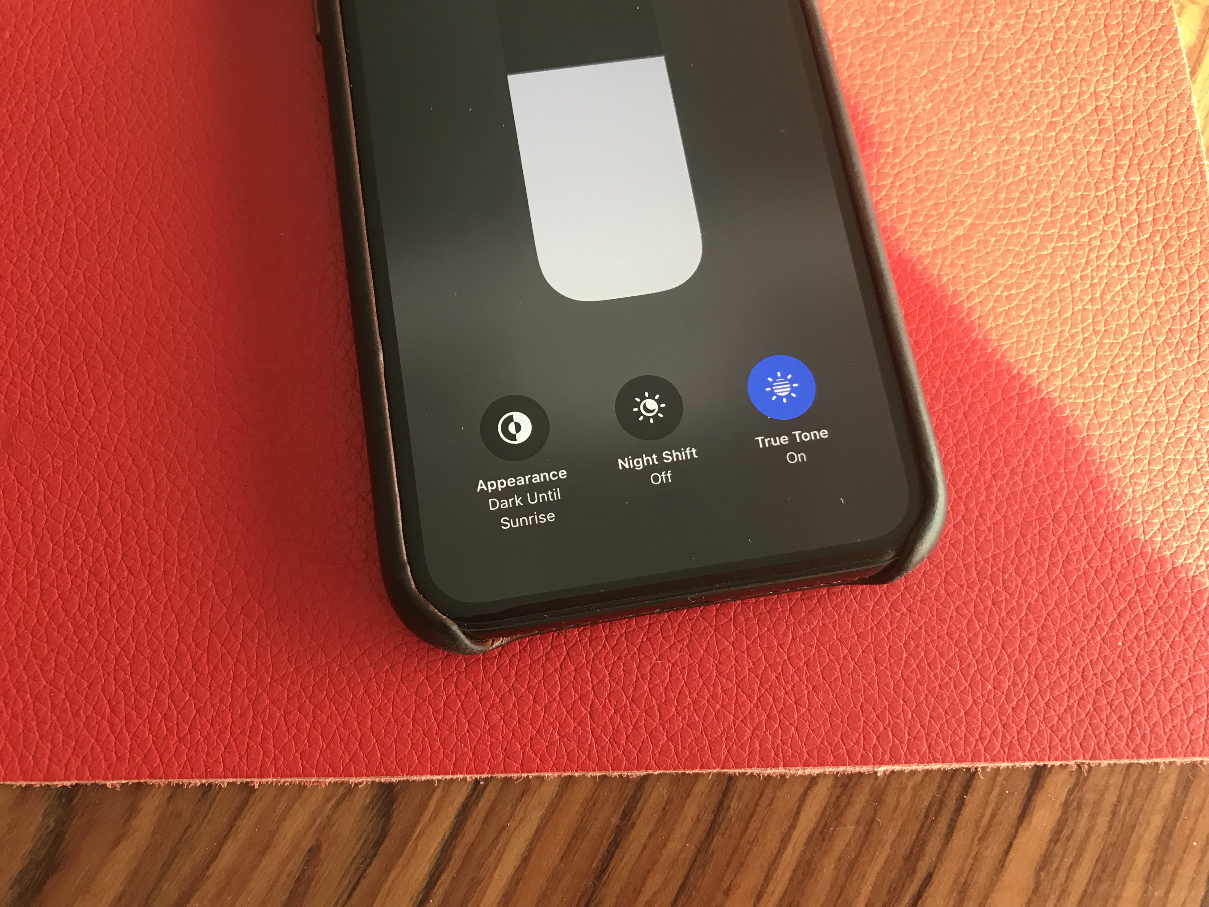
Dark Mode on iOS 13 is a system-wide trigger. You can activate it from the Settings app or by opening up the Control Center panel and long-pressing on the brightness indicator. And it completely transforms the look and feel of your iPhone.
While some third-party apps have been updated, many developers still have to release updates to make their apps work with this new setting. I hope in six months, you’ll be able to turn on Dark Mode and jump from one app to another without any white interface.
I would recommend turning on the automated mode in the settings. iOS uses your current location to time the change with sunset and sunrise — your iPhone goes dark at night and it lights up in the morning.
Dark Mode doesn’t just affect apps. Widgets, notifications and other buttons in the user interface become dark. Apple uses pure black, which looks great on OLED displays. And you can optionally dim your custom wallpapers at night.
The privacy hammer
Many geeks have tried iOS 13 over the summer. But it’s going to be a completely different story when tens of millions of people download it this fall. iOS 13 brings some much-needed changes on the privacy front, and it’s going to be nasty for some companies.
Apple is adding more ways to control your personal information. If an app needs your location for something, you can now grant access to your location just once. The app will have to ask for your permission the next time.
Similarly, iOS 13 can tell you when an app has been silently tracking your location in the background with a map of those data points.
Apple is shaming app developers directly by saying “This app has used 40 locations in the background in the past 2 days” and showing you a map. You can turn off location tracking directly in the popup. Facebook is already freaking out and wrote a blog post last week to tell you that it cares about your privacy.
iOS 13 also blocks Bluetooth scanning by default in all apps. Many apps scan for nearby Bluetooth accessories and compare that with a database of Bluetooth devices around the world. In other words, it’s a way to get your location even if you’re not sharing your location with this app.
You now get a standard permission popup for apps that actually need to scan for Bluetooth devices. Some apps actually need Bluetooth to communicated with connected devices, initiate peer-to-peer payments with nearby users, etc.
But the vast majority of them have been abusing Bluetooth scanning. To be clear, you can disable Bluetooth scanning and still use Bluetooth headphones. Audio will still be routed to your headphones just fine.
I hope many app developers will review the third-party SDKs that they use. Many ad-supported apps embed code from adtech companies. But they don’t always that those SDKs are hostile to your privacy.

Finally, Apple is adding “Sign In with Apple”. It is an alternative to “Sign In with Google” or “Sign In with Facebook”. Customers can choose whether or not to share their email address and developers get little personal data. It’s going to be interesting to see if it takes off.
Low-level improvements
There are a few changes at the operating system level. First, in addition to optimizations, animations have been slightly sped up. Swiping, opening and closing apps feels faster.
Second, the keyboard now supports swipe-to-type. If you’ve used Android phones or third-party keyboards in the past, you already know how it works. You can move your finger across the display from one letter to another without lifting it. It feels like magic.
Third, the share sheet has been updated. It is now separated in three areas: a top row with suggested contacts to send photos, links and more depending on your most important contacts.
Under that row of contacts, you get the usual row of app icons to open something in another app. If you scroll down, you access a long list of actions that vary from one app to another.
When it comes to automation, the Shortcuts is installed by default with iOS 13. Many people are going to discover Shortcuts for the first time by opening the app. Voice-activated Siri Shortcuts are now also available in the Shortcuts app.
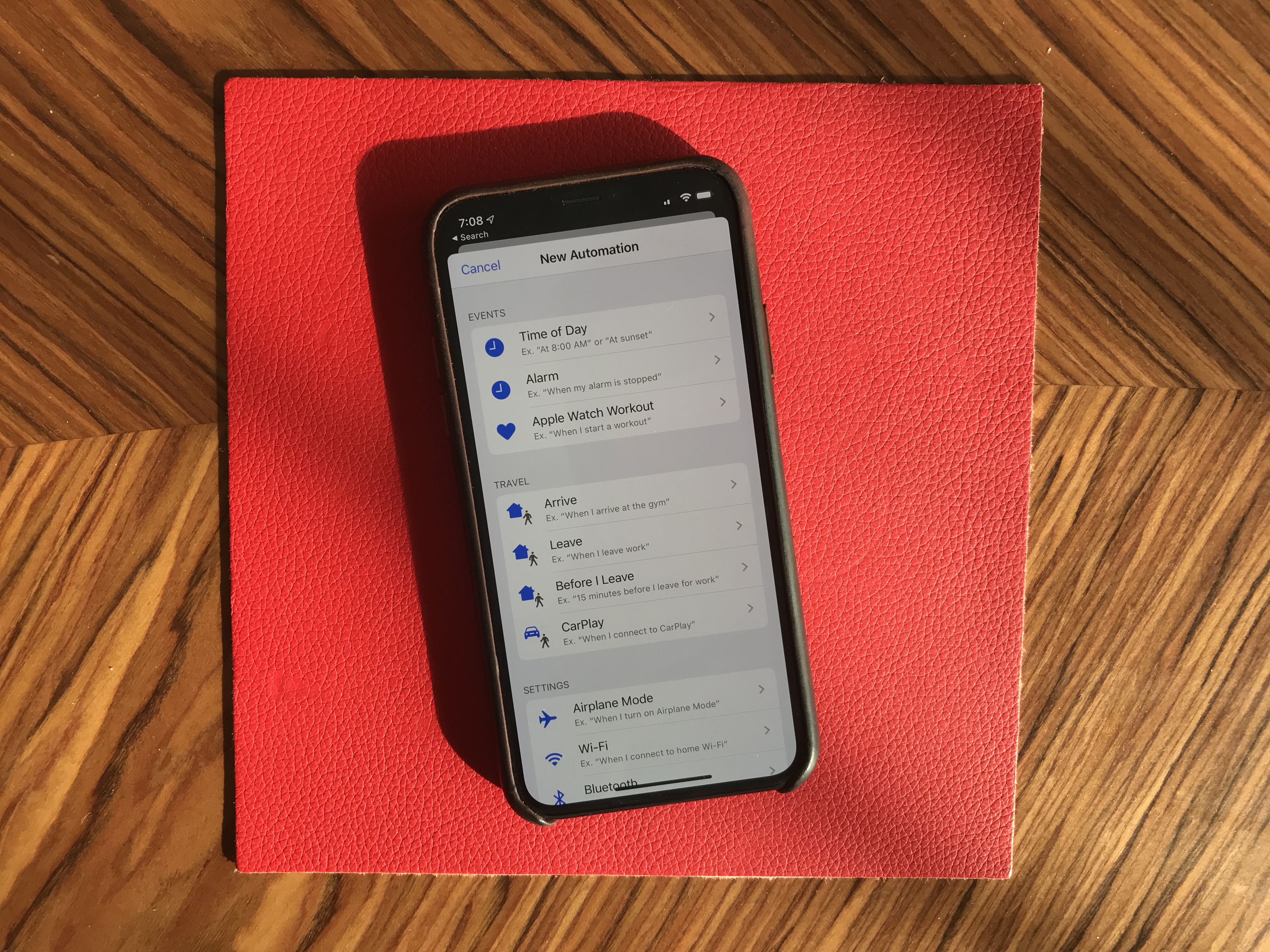
More interestingly, you can now create automated triggers to launch a shortcut. For instance, you can create scenarios related to CarPlay, a location or even a cheap NFC tag. Here are some examples:
- Launch a music playlist when I connect my phone to CarPlay or to my car using Bluetooth.
- Dim my screen and turn on low power mode when I activate airplane mode.
- Turn off my Philips Hue lights when I put my phone on an NFC sticker on my nightstand.
New app features
I’m going to go through some of the major changes in Apple’s apps.
Apple Arcade is here. You have to download iOS 13 to access it. I’ll let you read our first impressions in our separate article.
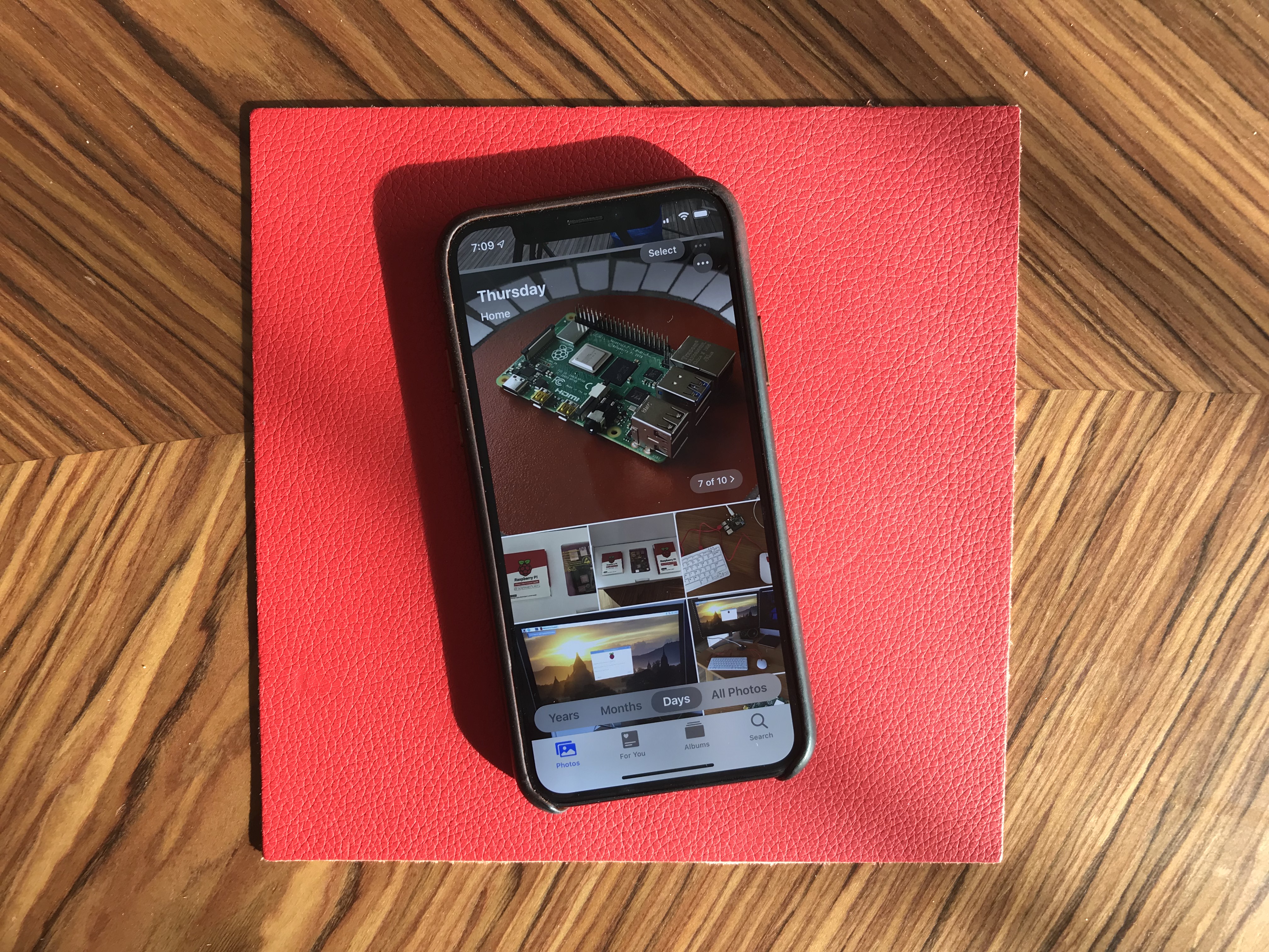
Photos has received some of the biggest improvements. The main tab has been completely redesigned. You now get four sub-tabs that lets you see a curated photo library.
In addition to ‘All Photos’, you can tap on ‘Years’ to jump straight to a specific year, ‘Months’ to see some smart albums based on dates and locations. You can then open those events. It’ll jump to the ‘Days’ tab and show you the best photos.
I’m not sure I like the wording of those sub-tabs, but it’s definitely a lot more efficient if you’re looking for an old photo from a few years.
Photo editing is also much better on iOS 13. It feels like you can do pretty much all the basic editing you’d do with a third-party app.
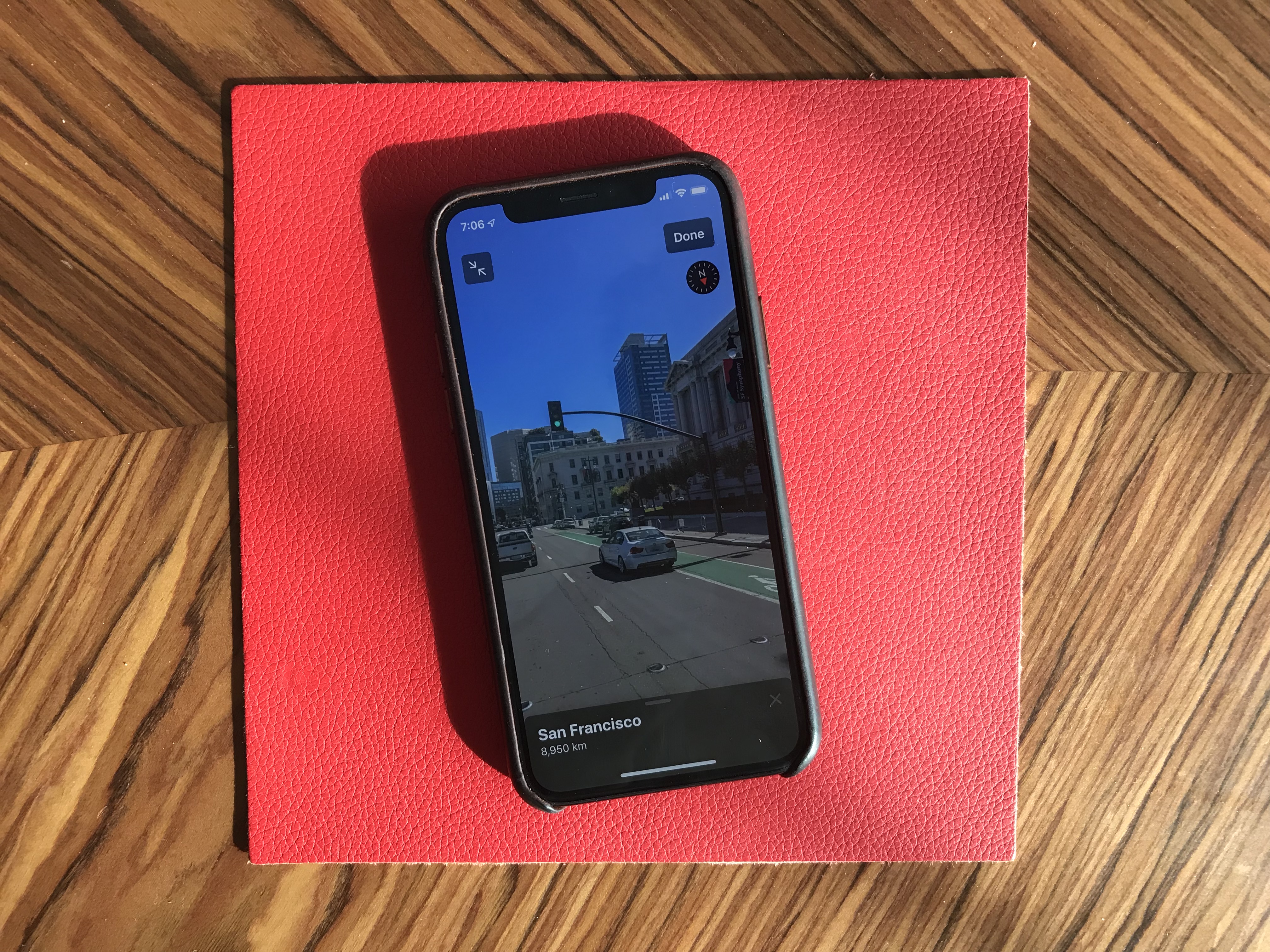
Maps is an interesting app. While Apple has been working on improved mapping data, it’s going to be hard to notice if you don’t live in California. But Look Around, a feature that works pretty much like Google Street View, is quite impressive. This isn’t just 360 photo shots — those are 3D representations of streets with foregrounds and backgrounds. I’d recommend finding a street in San Francisco and opening Look Around.
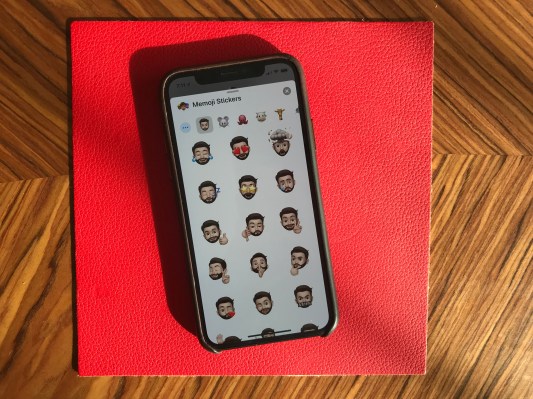
Messages now works a bit more like WhatsApp. By that, I mean that you can pick a profile name and picture and share those with your friends and family. Apple also tells you to use Memoji, but you can pick any photo. Search in Messages is also much better.
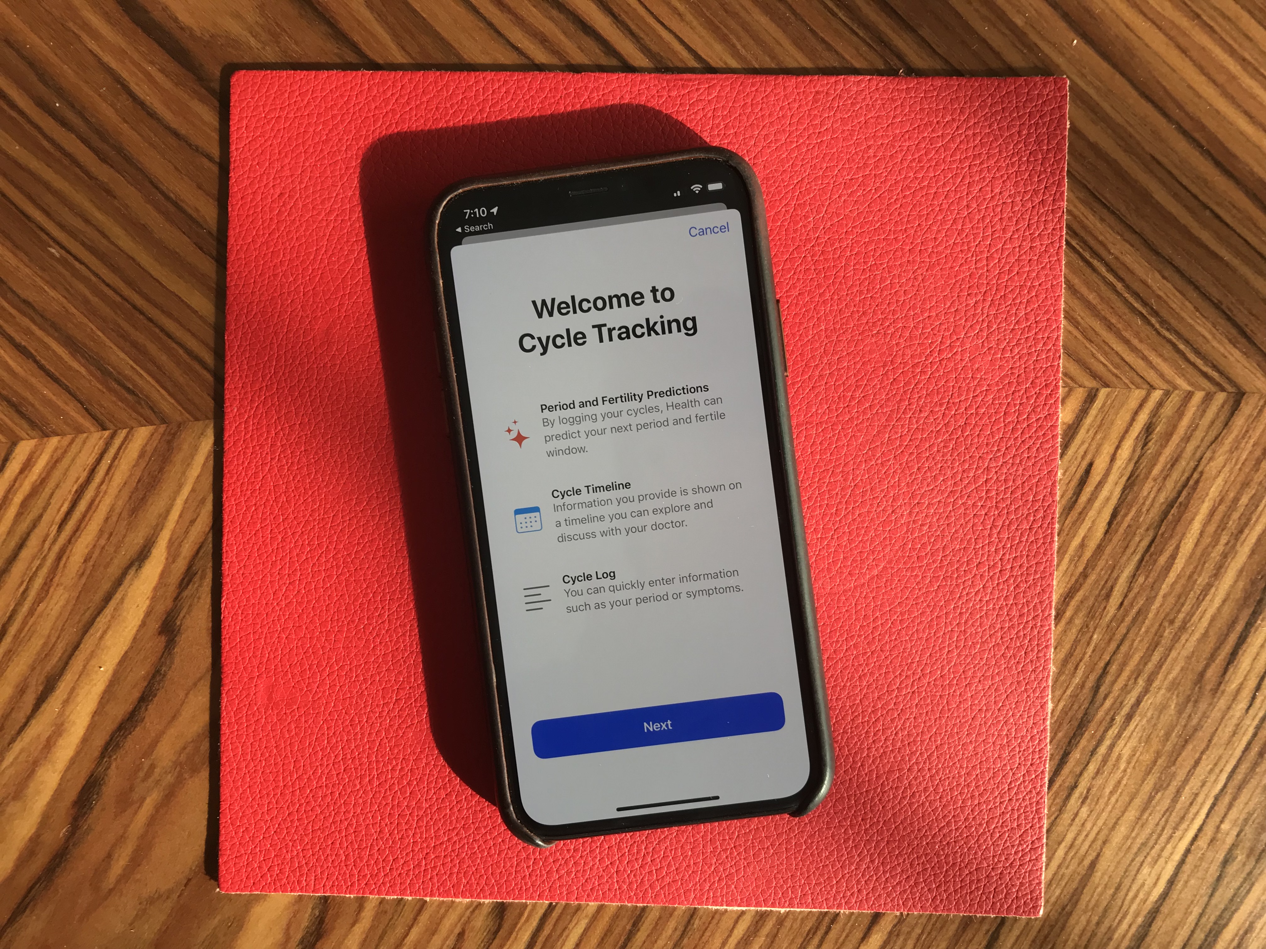
Health has been slightly redesigned. But the big addition is that you can track your menstrual cycles in the Health app. You don’t need to install any third-party app.
Reminders has gained some new features. There’s a quick toolbar to add times, dates, locations and more. You can indent items, create smart lists and more. To-do apps are highly personal, but I’m sure some people will like it.
Find My is the new name for Find My Phone and Find My Friends. Maybe you’ll be able to find your objects soon when Apple launches Tile-like trackers?
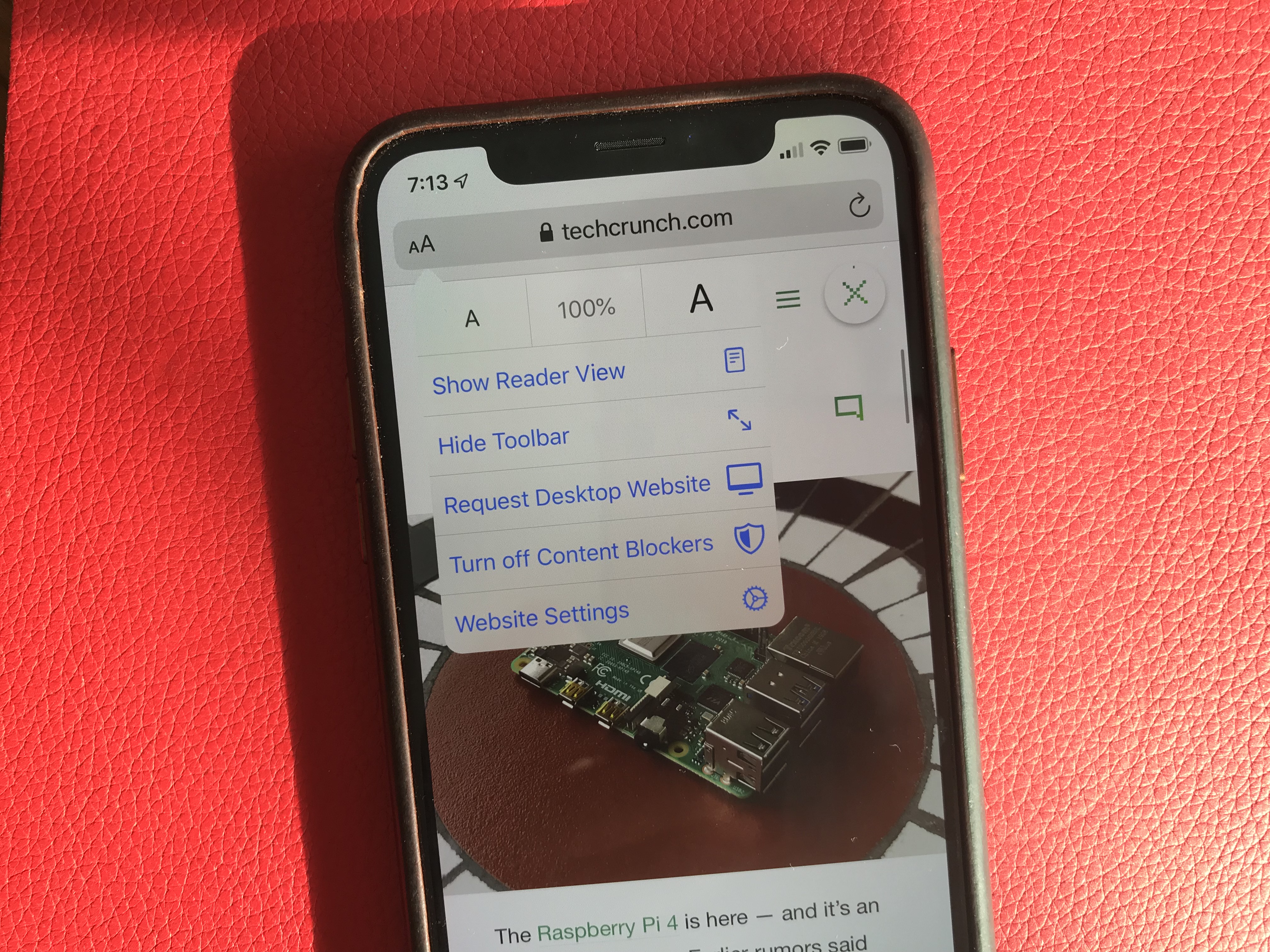
Mail, Notes and Safari received small improvements, such as rich-text editing in Mail, a gallery view in Notes, a new site settings popup in Safari to request the desktop site, disable a content blocker or enable reader view.
Files works with Samba file servers and you can zip/unzip files directly in the app — no shortcut needed. You can also install custom fonts.
As you can see, there are a lot of big and tiny improvements across the board with iOS 13. Sure, this version feels buggy at times. It’s an ambitious update with Apple telling everyone that they’re not ready to slow down the pace of iOS releases. And Apple is making some welcome progress on the privacy front.
